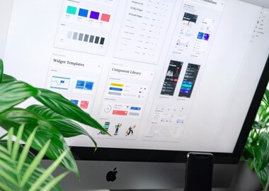
10 Tips for Excellent Dashboard UX Design
Effective dashboard UX design is the key to a short time to insight. It powers informed decision-making and leads to successful business outcomes. But designing a dashboard is not a rookie job. It requires balancing clarity, usability, and relevance while figuring out how to squeeze the maximum amount of valuable data into limited space.
In this 7-minute read, we share the principles of designing effective dashboards and a few tricks to create a user-centered intuitive dashboard experience. You will learn about:
- Types, components, and key characteristics of modern dashboards
- 10 tips for dashboard UX design that will help you build an excellent user experience
- Common challenges in creating dashboards and ways to solve them
Before we get to dashboard UX design best practices, let’s first define what we understand by UX design in dashboard development and review the key components of a high-performing dashboard.
Dashboard UX design is the process of combining and organizing various metrics, data visualizations, and controls in one intuitive interface. The main goal of a designer is to create a central hub for the most critical information and provide users with a set of tools to explore and interact with data. A well-designed dashboard has the following characteristics:
- Relevant. Users get only relevant information, prioritized based on their goals and needs.
- Scannable. Users quickly find their way around the dashboard and get all important data at a glance.
- Discoverable. Users can easily navigate the dashboard and find the insights they need.
- Functional. Users have a convenient toolkit to manipulate data — explore, filter, compare, drill down, analyze, export, and share.
- Personalized. Dashboard views are tailored to the needs of different user groups providing the right information to the right people.
As you can see, a great dashboard design is not just a pretty face. Its ultimate goal is to cut time to insight, empower decision-making, and give users a set of tools to work with data and get things done.

Example: Website traffic analytics dashboard. Image credit: Semrush.
Major types of dashboards
- An operational dashboard is a hands-on tool for frontline employees and managers to monitor and control routine operational processes.
- Tactical and strategic dashboards provide management with business insights for short-term (tactical) and long-term (strategic) decision-making.
- Analytical dashboards integrate data from diverse sources for in-depth analysis, trend monitoring, and forecasting.
Other common types include telemetry dashboards for tracking real-time streaming data, account dashboards that help users navigate a platform or service, and various industry-specific dashboards.
The type and purpose of a dashboard have a major influence on UI/UX dashboard design and determine the composition and relations between its key components.
Key components of a dashboard
- Navigation is a crucial element that enables users to move around and interact with different views and elements of a dashboard.
- Cards act as containers for specific information or content and unite in a responsive dashboard layout.
- Data visualization is a representation of different types of data in the visual form — charts, maps, graphs, diagrams, etc.
- Data labels, legends, and tooltips are instrumental elements that add context, explanations, and cues to every card, data visualization, or view.
- Data tables are structured representations of large volumes of data such as lists or records in tabular form.
- Controls and actions are the tools to explore data beyond the original dashboard view — select, zoom in or out, filter, drill down, create reports, export, share, compare, etc.

Key components of a dashboard on a sample view.
Start with user research
Just like the UX design process on any other software project, dashboard design UX process starts with user research. This is a fundamental step that will help you understand user goals and expectations and translate this information into clear design requirements. You will know who your users are (personas) and how they are going to interact with your dashboard (user flows).
If you want to learn about different methods and techniques for user research, check our guide to user-centered design for digital products.

Example of a documented user persona.
Analyze competitors
Competitor analysis is a handy technique, especially if you need to create a dashboard UX design from scratch. When you analyze what other companies in your niche offer, you may discover industry standards and workflows, find features you haven’t thought of, review existing design approaches, and learn from competitors’ mistakes. Treat it less like a source of inspiration and more like market research.

Example of a mood board for website traffic analytics dashboard.
Provide useful clues and tools
Remember the key characteristics of a great dashboard? It must be easy to figure out, navigate, and interact with. These are the absolute dashboard UX design rules. Ideally, users should always be only a few clicks away from achieving their goals or getting the insights they are looking for.
How do you do that? Along with a clear layout and convenient navigation, use helpful design elements and components such as tooltips, data labels, and on-hover clues to strategically guide users around your dashboard and cut the learning curve. And equip them with easy-to-use controls and action features to dig deeper into data.
The real trick is to understand which elements to use and how to weave them into your design to address the needs of your users. This is when the user research comes in handy. Analyzing user journeys, goals, and expectations will help you choose and prioritize the right elements for a successful dashboard experience.
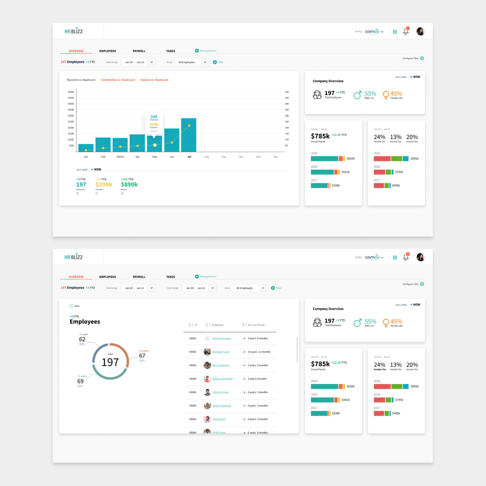
Interactive filters and action features on an HR dashboard we designed for an HRM SaaS.
Choose the right visualizations
Your choice of data visualization techniques will directly impact how quickly dashboard users will be able to grasp and analyze data. So it’s kinda important.
There are obvious choices. For instance, using a map to show geo data or a line chart for website traffic dynamics. However, not every case is this clear. To pick the right techniques and data visualization elements, analyze carefully the data you are going to show — type, volume, dynamics, number of variables and data points per chart, etc. Then combine it with user goals — what insights users want to derive from data, how they will interact with it, and what features they will need to further explore data. This will help you choose the right visualizations for your dashboard design.
And remember to test your visualizations with different volumes of data. This is one of the dashboard design UX best practices that will help you avoid undecipherable and confusing charts that used to look good with the test data but failed once things got real.
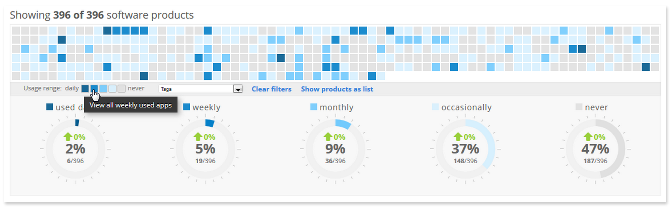
Heatmap on an IT infrastructure monitoring dashboard helps identify software performance patterns.
Stay consistent
Consistency is one of the fundamental dashboard UI/UX design principles. Once you choose color coding, textures, fonts, data visualizations, and design elements, stick to them across your dashboard views. This will help users quickly orient themselves on your dashboard and get used to the layout and patterns. So when they get to the next view, they will feel at home.
For example, if you use a specific color coding for visualizing data, make sure to use it across different dashboard views and cards that communicate the same information.

We use consistent color coding across bar charts, tabs, and on-hover cues on an HR dashboard.
Cut time to insight with a powerful dashboard
Create a value-driven dashboard that helps you make decisions faster than anyone else in the market.
BUILD A DASHBOARDGroup related data
This little trick will save your users a lot of time and, as a result, boost engagement on your dashboard. By grouping similar metrics and related data into one section, you create easy-to-find touchpoints for your users. Depending on their goals at a given time, users quickly get an answer or information they need without trying to combine data from different cards or views.
Once you group your data, use common dashboard design UX patterns to arrange it conveniently in the dashboard layout. Place the most important information based on the eye-tracking patterns and reading culture of your target audience to amplify the effect. And remember, your prime space is always above the fold.

Key performance metrics grouped on an influencer marketing dashboard.
Avoid clutter
It should take less than 5 seconds for users to get an answer or find the information on a dashboard, according to major dashboard UX design guidelines. Clear layout, grouping, labels, and clues all help to minimize time to insight. But one seemingly insignificant thing can ruin it – lack of space.
Cluttering and oversaturating your dashboard with data will reduce your users’ ability to quickly find what they need. It makes the dashboard experience confusing, one extra card at a time. To avoid cluttering, focus on only 1-3 important tasks users want to accomplish and build a dashboard view around it.

Inventory management dashboard view shows only the most important data and actions for one task and provides easy navigation to other views.
Consider device constraints
A responsive easily scalable card layout is ideal for creating UX design for a dashboard. But it doesn’t mean that you can simply adjust the grid for mobile and call it a day. When you build a dashboard, you need to consider device constraints and the context of using a dashboard on small screens. Then tailor your design accordingly.
For instance, if you build a dashboard for a banking application, think of the scenarios when it will be used on mobile and highlight the most frequently used actions. Or when building a vendor portal, instead of making users scroll an endless list of vendors on a smartphone, consider leaving only a 10-row table and adding features to open it on demand.

When designing an influencer marketing platform, we customized the dashboard view for mobile to put forward the most useful action that could be used on the go.
Test early on
Regular and frequent testing is one of the core design tactics that will help you create useful and engaging dashboard experiences. Test user workflows and design decisions early on when you are still working on wireframes and prototypes. It will help you avoid costly mistakes and make sure only the best of dashboard UX design gets into the final product.
Gather and leverage user feedback
You’ve created a killer dashboard UX design and built a functional interactive dashboard. You’ve tested it in the lab and in the field. It’s time to gather the second most important data after user research — feedback.
This information will help you understand if the dashboard design principles and choices you made resonate with your audience and enable an effective user experience. Gear up with heatmaps, usage analytics, user reviews, and feedback to figure out how to make your dashboard even better, add missing features, and polish user workflows.
B2B competitor analysis
As you already know, competitor analysis is a handy strategy when all you have is a blank page. But conducting a competitor analysis in the B2B space can challenging and, in some cases, not even possible. Especially if you build something innovative or deal with sensitive data.
This is when cross-industry research and expertise can save the day. Gathering insights and integrating best practices of dashboard UX design from successful projects in different sectors can give you direction and gain a good understanding of user behavior and expectations.
Bridge the needs of multiple user groups
You may have one distinct group of users, two, or many. Every persona in your user portfolio is an additional set of goals, requirements, and workflows. And you need to make sure your dashboard UX design is tailored to their needs.
Personalization and customization are two similar but different techniques that can help you bridge the requirements of different types of users. Personalization involves adjusting your dashboard to the individual characteristics and roles of your users, for instance, by combining different data and views for senior executives and frontline managers. Customization implies allowing users to configure and adapt dashboards to their requirements by providing features to create custom views, change color schemes, add metrics, etc.
Global leaders in logistics, healthcare, publishing, and retail, including Oxford University Press, Diaceutics, Adorama Camera, and Mercans trust our experience to create interactive dashboards for their data-driven solutions and business intelligence operations.
Leverage our decade-long experience in UX/UI design and development to create an effective dashboard for your digital product. Whether you are looking for seasoned creatives to design a functional user-centered dashboard or need a cross-functional team to develop a data-driven solution from zero, we have the right specialists for the job. We can help you:
- build a dashboard UX design and user interface tailored to the unique requirements of your users
- modernize your existing dashboard using the major rules for dashboard UX design
- integrate data visualization and analytics tools into your digital product
- design, engineer, manage, and support your data-driven solution
Transform data into your competitive edge
Unlock the power of data-driven decisions with an intuitive dashboard and easy access to valuable insights.
HIRE DASHBOARD DESIGNERSWrap-up
- A well-designed dashboard prioritizes clarity, relevance, and fast time to insight, empowering decision-making and providing practical tools for efficient data manipulation.
- Following the rules for practices dashboard UX design will help you create an efficient user experience enabling high adoption and engagement rates.
FAQ