Guide to Creating Powerful Data Visualization Dashboards
A well-designed data visualization dashboard is your ultimate tool for making strategic and operational decisions faster. It delivers insights in a matter of clicks. No noise, no silos, no spreadsheets.
No wonder companies in all major industries invest in dashboard development.
Interactive visualizations and dashboards are among the top 5 technologies for adopting business intelligence among IT, financial services, telecom, healthcare, and other industries. Source: Forbes
In this post, you will learn how to design and build powerful dashboards for your business. You will get 10 practical tips to create a data visualization dashboard that will help you cut time to insight and gain a competitive advantage.
Data visualization dashboard is a central hub for your data. It collects related data sets and visualizations from different sources arranged to deliver insights quickly and effectively. So when you need to find some information, you get it right there without digging through 50-page reports or switching between several tools.
All effective dashboards have one thing in common. They present just the right amount of data to give you a complete picture while removing distractions and cognitive overload. And you get the tools to further explore individual data sets – filters, views, report builders, etc. To design a useful intuitive dashboard, you need to consider your purpose and business goal, target audience, type of data and dashboard, and context and environment.
Before we get to practical advice on how to build data visualization dashboards, let’s overview a few common applications and types of dashboards.
Dashboard for data visualization: purpose and applications
Data visualization software helps companies in all major sectors leverage data to optimize performance, improve security, and increase revenue and operational efficiency. Applications vary depending on the industry and goals. Here are just a few examples:
- Operational managers in logistics and manufacturing monitor performance and operational metrics to make decisions regarding the use of resources, equipment, people capital, etc.
- C-level executives analyze revenue, costs, and expenses on profit and loss dashboards to build strategies and allocate budgets.
- Sales and marketing teams track inbound and outbound campaigns, analyze conversions, and optimize their strategies across different channels.
- HR and recruiters use dashboards to gain visibility and optimize talent sourcing and people management.
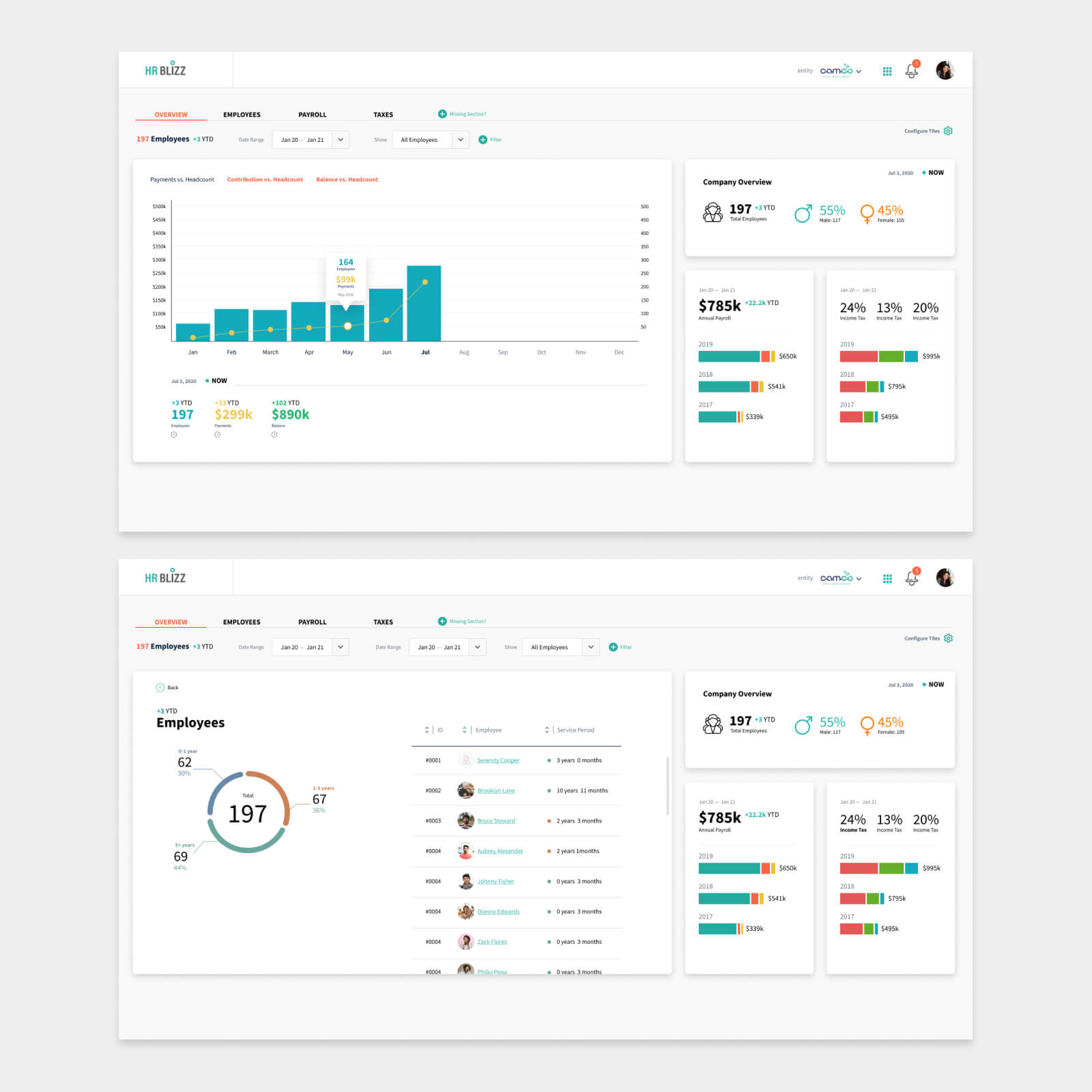
Example: Interactive dashboard for payroll and people management.
Common data visualization dashboard types
- Operational dashboards are widely used for routine monitoring. They provide data for operational decisions and performance optimization activities (inventory management, maintenance scheduling, etc.).
- Tactical and strategic dashboards target mid and senior management and deliver business insights for short-term (tactical) and long-term (strategic) decisions.
- Analytical dashboards combine data from various sources for in-depth analytics, trend monitoring, and forecasting in a certain industry or area (trading, finances, environmental monitoring, etc.).
- Telemetry dashboards work with real-time streaming data often related to system performance or sensor readings. These dashboards are common in healthcare, manufacturing, smart farming, and energy. Telemetry is also an integral part of IoT solutions.

Example: Operational dashboard for real-time order management and production monitoring.
Analyze your target audience
User research is essential to make a data visualization dashboard tailored to the unique requirements of your target audience. It will help you understand which metrics to show on your dashboard, how to organize them, and what features will be helpful for different categories of users. Consider also the context and environment in which users will work with your dashboard.
Personalise user experience
Once you understand your audience, you will be able to personalize dashboard design to the goals, skills, and roles of distinct user groups. For example, you can add clues, on-hover information, descriptive labels, and references to help cut the learning curve for users with no tech or analytics background. On the contrary, add features to drill down data and create customized views for analysts looking for deeper data storytelling.
Example: Grafana dashboard provides rich controls and custom filters for data drill-down.
Analyze competition
Competitor analysis is a useful technique and source of ideas if you build a data visualization dashboard from scratch. Review what other companies offer in your niche to find valuable features and patterns, reveal the strengths and weaknesses of competitors, and discover untapped opportunities that you could turn into your own competitive advantage.
If you work in a B2B space, however, it may be harder to access this information. In this case, you can also refer to cross-industry examples and general best practices. Looking for inspiration? Check tried-and-true applications like Google Analytics or the CRM you or your team have been using for years.
Choose data visualization techniques
Some data visualization techniques are better for certain data types and analytics goals than others. For instance, heatmaps help reveal trends, patterns, and anomalies with color gradients. Line and area charts show the dynamics of time-series data and work great for developing real-time data visualization dashboards.
By choosing the right visualization techniques, you minimize time to insight and make sure users will read data correctly and get the information they need fast.
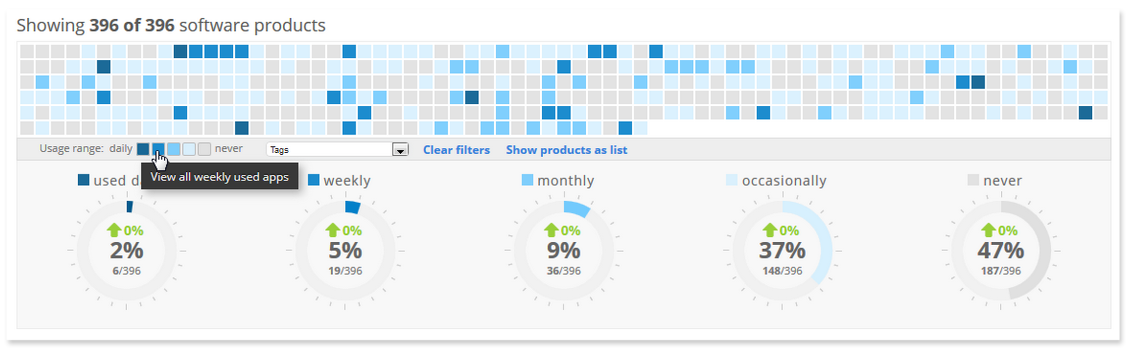
Example: Heatmap chart on an IT infrastructure monitoring dashboard helps identify software usage patterns.
Consider device constraints
Your dashboard must be responsive and provide equal value on large and small screens. In practice, it means that you will need to come up with optimal layouts for different device sizes. In some cases, you will have to regroup metrics and add features to navigate a dashboard on a smartphone screen.
Remove clutter
Cluttering dashboards with too many visualizations doesn’t make it more informative. On the contrary, it may have the opposite effect complicating the data analysis process. To make sure users can easily find the information they need, remove unnecessary metrics and leave enough white space to keep focus on relevant data.
Deliver value early on
When you think of how to make a data visualization dashboard that brings maximum value, focus on the primary goal of the end user. It will help you select the right visualizations and metrics that communicate the most important information and draw the key insights. Then add views and features to further explore the data.

Example: Loan dashboard on an HR platform gives the general overview and provides filters, tabs, and reporting features for detailed analysis.
Stay consistent
Consistent color coding, hierarchy, and design elements will reduce the learning curve and help users discover insights faster. Stick with the chosen design patterns, fonts, colors, and layout principles across all dashboard views. The same applies to the choice of visualizations — use one data visualization tool and technique for one type of data.
Test dashboards with different data volumes
Testing is an essential stage of creating an effective data visualization dashboard. Many teams make a mistake at this point using only a small fraction of data to test. Everything looks fine until it’s not. Once the system goes live, dashboards start receiving real data and behave not as expected.
So make sure to test visualizations and layouts using various volumes of data and check how your dashboard looks and behaves in different conditions.
Monitor and optimize
Monitor the use of your dashboard and gather feedback after the release. It will help you further optimize and add valuable features to your system.
Get valuable insights faster
Build a powerful dashboard to speed up data analysis and simplify your decision-making process.
SHOW DATA SERVICESExample 1. Dashboard for a global payroll and HRM SaaS
Goal: Create a dashboard with data visualizations to get a 360-degree view of payroll and talent management processes. Read the success story…

Example 2. Interactive dashboard for IT infrastructure monitoring
Goal: Gather and organize essential metrics to monitor IT infrastructure performance and security and receive timely alerts and recommendations. Read the success story…

Example 3. IoT energy consumption and storage management platform
Goal: Analyze sensory data in real time to get energy consumption insights, discover trends, and build a data-driven energy usage strategy. Read the success story…

Enhance your decision-making process with powerful data visualization tools and quick access to valuable insights. We can support your journey to a data-driven organization every step of the way, including:
- UX research and custom dashboard design and/or modernization
- Data visualization dashboard development
- Data engineering, analytics, visualization, and infrastructure management
- Development and support of customizable ETL data pipelines
Companies like Oxford University Press, Diaceutics, Origin Digital, Applixure, feed.fm, and Adorama Camera trust our experience and use our design and data engineering services to leverage their data and integrate business intelligence into their operations.
Wrap-up
- Data visualization dashboards help businesses make faster strategic and operational decisions across various industries and applications.
- Using practical advice on how to create a data visualization dashboard you can equip your organization with powerful data visualization tools and access valuable insights.
Exploit the full power of your data
Build a data visualization dashboard to get the right insights, at the right time.
HIRE DASHBOARD DEVELOPERSFAQ
- Make user research to tailor your dashboard to the needs of the target audience.
- Personalize UX to the goals and skills of different user groups.
- Gain insights from competitor analysis.
- Select the right data visualization techniques.
- Ensure dashboard responsiveness across devices.
- Avoid clutter by removing unnecessary metrics.
- Prioritize delivering immediate value to end users.
- Maintain consistency in design elements and visualizations.
- Test dashboards with varying data volumes.
- Monitor and optimize your dashboard after release.